
My Role
UX/UI Design Consultant 2019-2020
Contract RemoteSkills
UI Design UX Design Visual Design Prototyping Responsive Design Design Systems Pattern Library Brand Strategy Illustration Motion Graphics Wireframing Data Visualization Interaction Design Video EditingTechnologies
Adobe XD Balsamiq Photoshop Illustrator HTML CSS CSS Grid / Flex Font-end Frameworks Github Sublime Text Javascript Ruby SVG Adobe Animate Adobe PremiereCompany
Rivet Networks
SaaS B2B B2C StartupBackground
Rivet once part of Qualcomm, had recently branched out to form their own company whose main focus is on bringing users network performance software and hardware. As so far, Rivet's approach has been primarily in embedding their product within Dell's Alienware, MSI, and other PCs outfitted for online gaming. Rivet's main product has been the Killer Control Center, with features 'Xtend', 'WifiOptimizer', and 'Doubleshot'. They were great products that were needing some reflowing and retooling and a fresh take on overall look & feel.
Project Goals
- Understand user base needs and technical limitations to network performance.
- Take what current UI and reflow and redesign overall look and feel.
- Develop a new brand identity.
- Steer certain product features toward accommodating web-based technologies.
- Create animated marketing videos.
Project
The current windows application was needing to be optimized for user experience as well as to establish a visual design language. In addition, Rivet needed help in designing and building a proof of concept for two stand-alone applications to highlight features in their current Winform app.
Approach
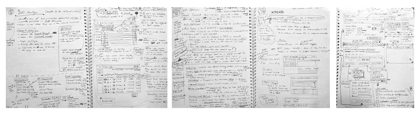
I interviewed stakeholders and reviewed available documentation, reviewed competitors, to see what tools and other solutions people are using. I made a list of what is understood by general users and what would be advanced features and removed unnecessary or redundant elements. My aim was to organize, condense and simplify the tools sets into useful sections, and create a unified brand identity. I also found that the user-base was very limited due to the chosen platform being a WinForms app that can only operate on a PC. I proposed that the stand-alone apps I was to design be made using web technologies that could be wrapped using something like Electron in order to make it available to more users, devices, and platforms. This was well accepted so I started designing for a web-based prototype. Overall, I built out wireframes, hi-fi mockups, and coded front-end prototypes.
Competitive Analysis
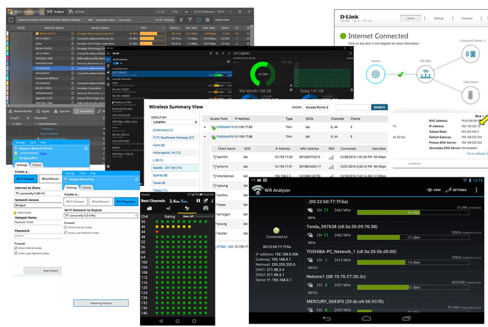
In my review of the immediate competition, I found most of the tools out there to be fairly confusing or not very effective. I also found the aesthetic designs of many UIs to be lacking in personality and modern design standards.


Product Design Evolution
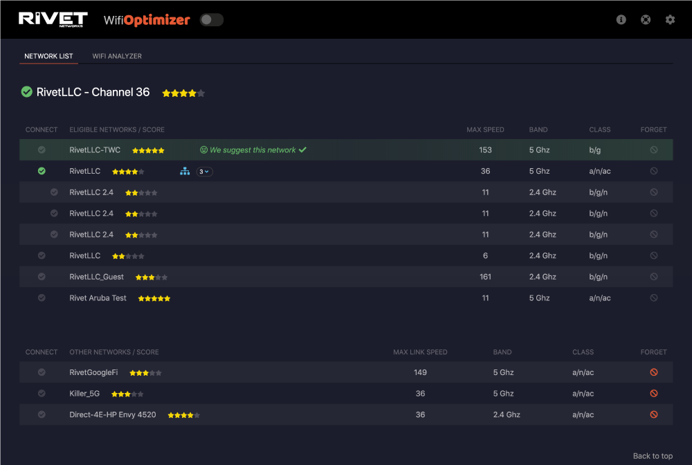
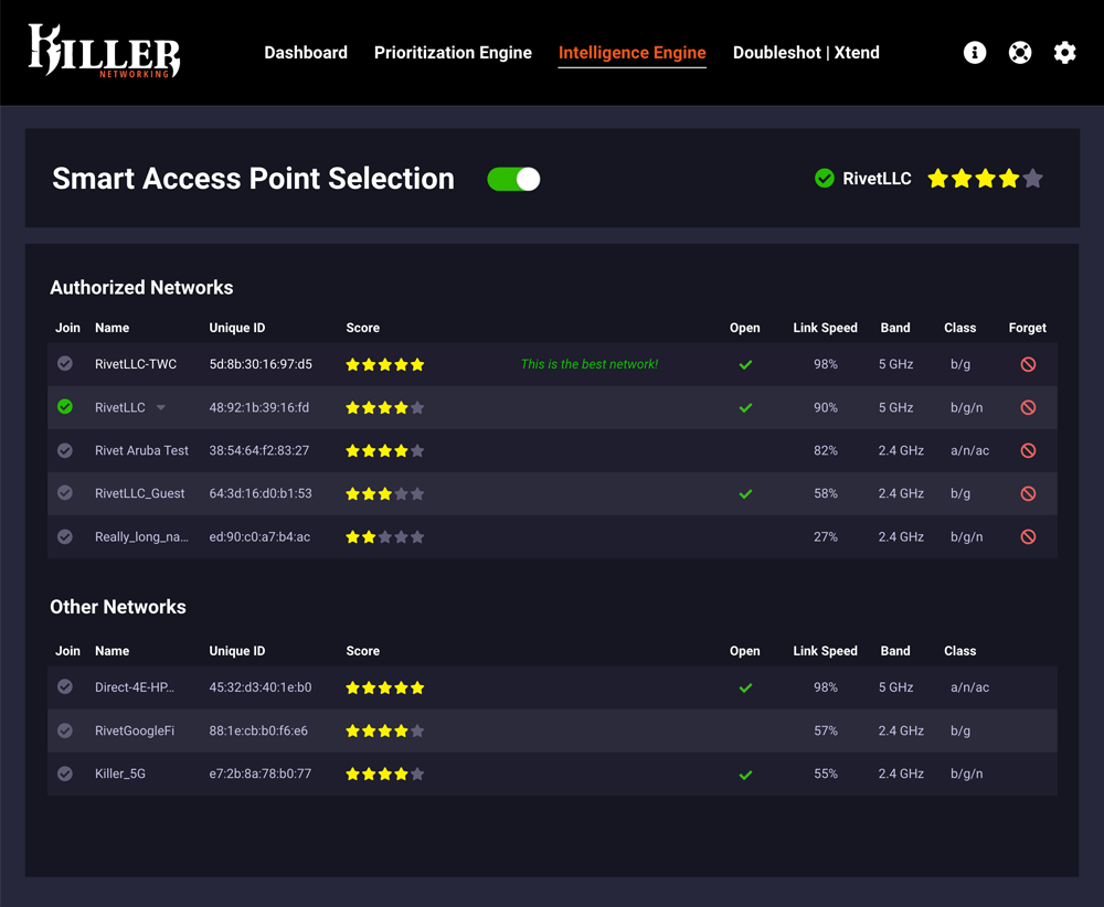
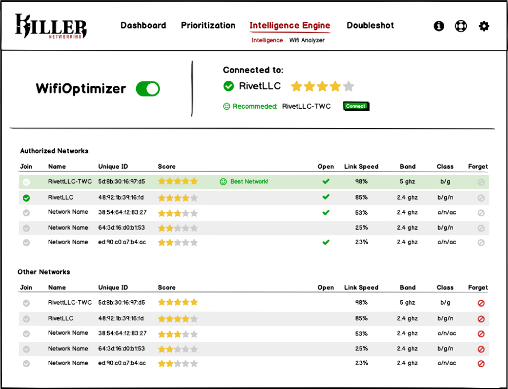
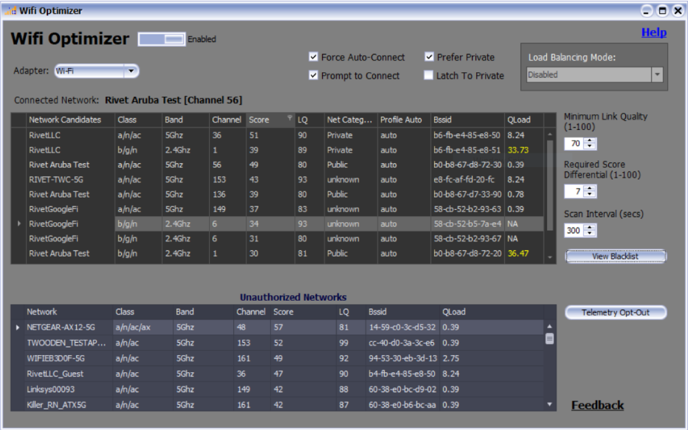
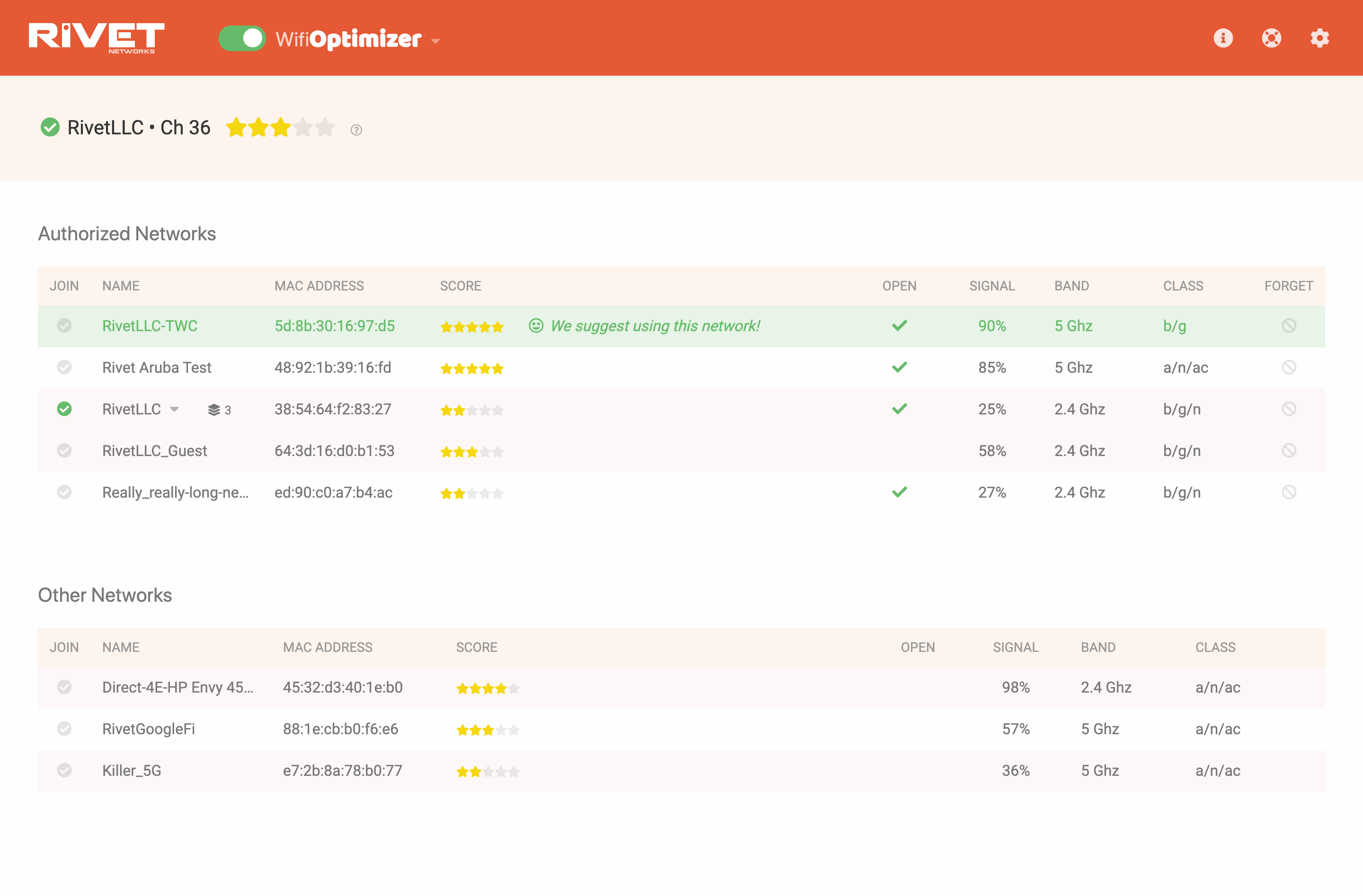
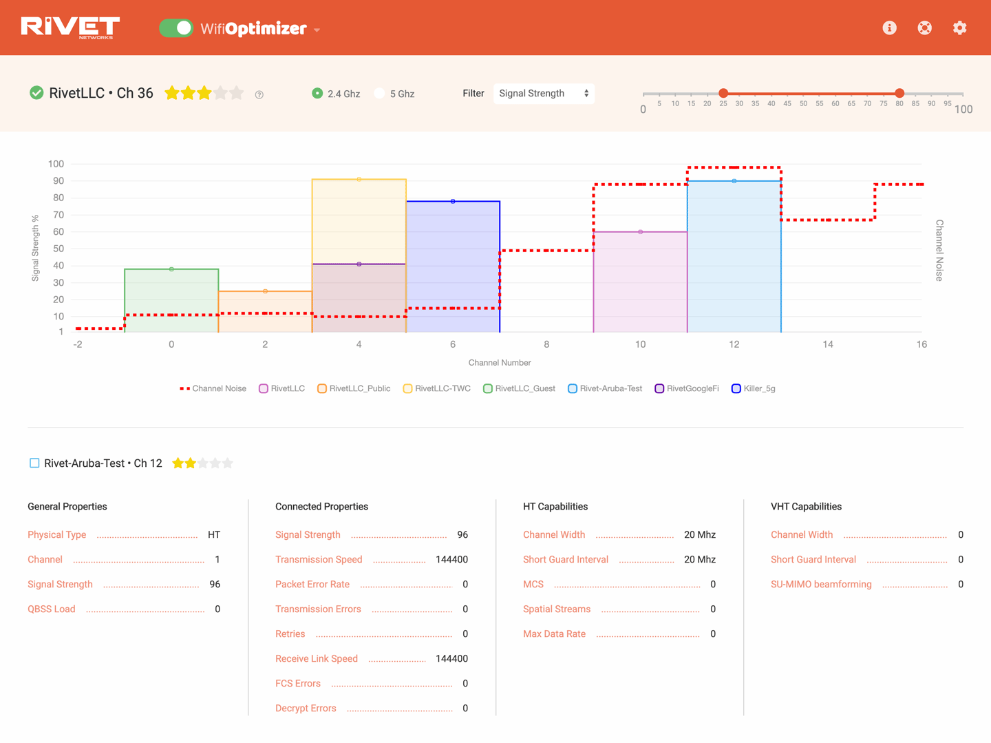
The 'WiFi Optimizer' uses an algorithm that scores all available access points based on key quality metrics. This product has had many names, and I have worked on at least 4 variations for this feature/product. The 'WiFi Optimizer' offers a recommendation to the user if a better access point is found. This feature can also be set to automatically switch to the best access point they have credentials for.
Product redesigns, before and after shots
WifiOptimizer (Original UI - before)
Web Application (Redesign - after)

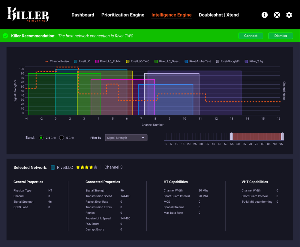
Wifi Analyzer (Original UI - before)
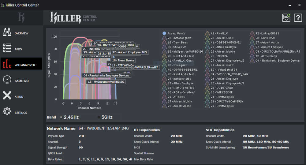
High-fidelity (Redesign - after)
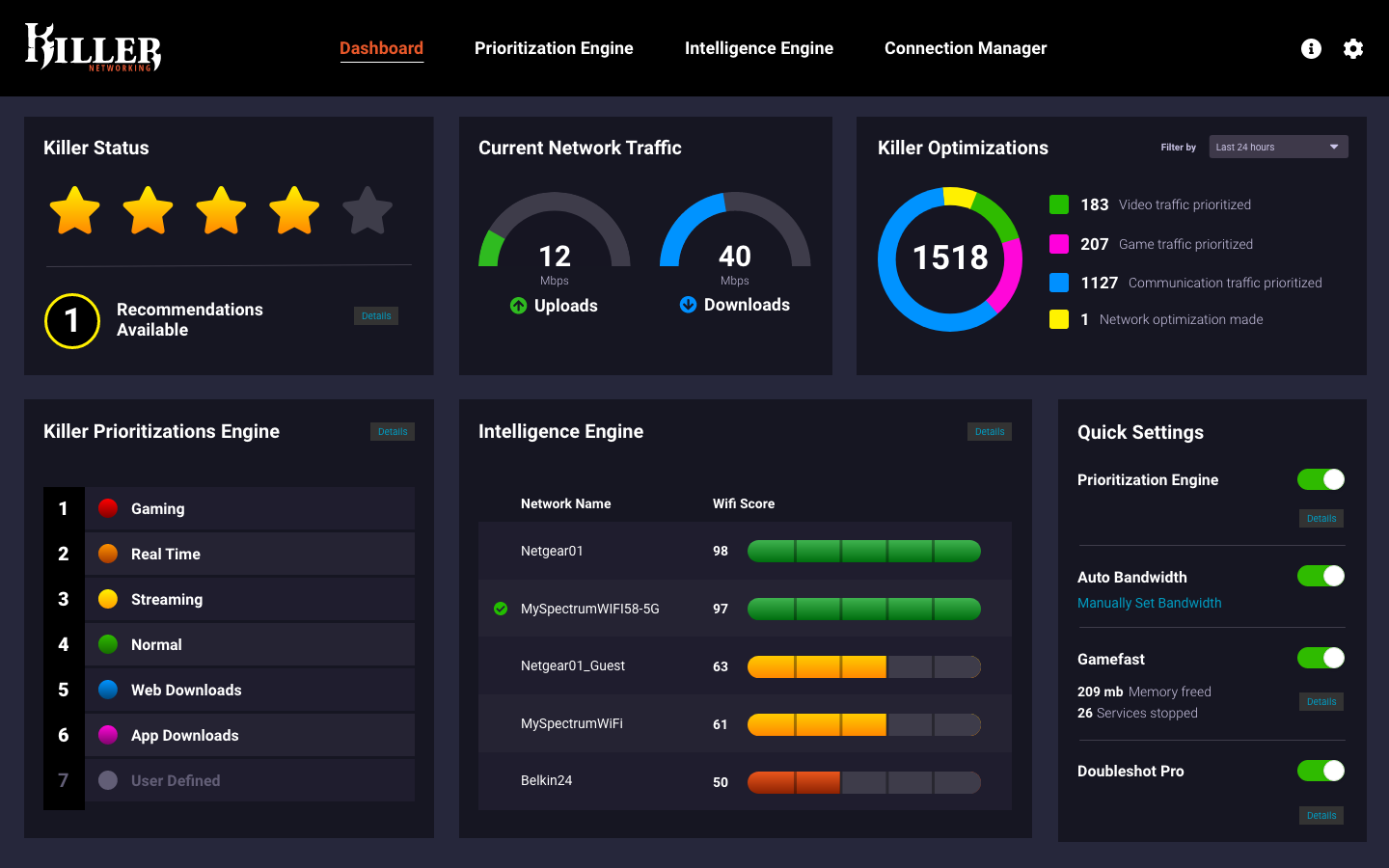
Dashboard Overview (Original UI - before)
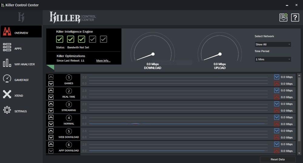
High-fidelity (Redesign - after)
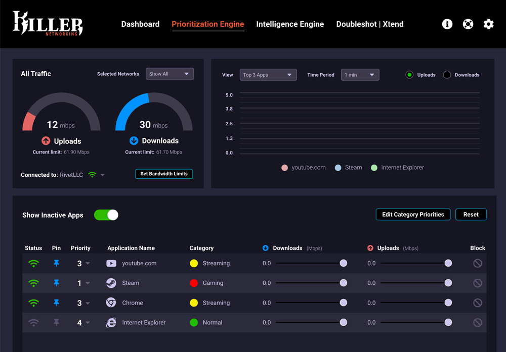
Prioritize Apps (Original UI - before)
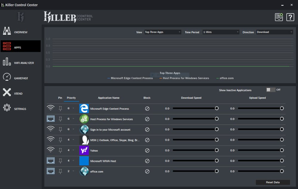
High-fidelity (Redesign - after)
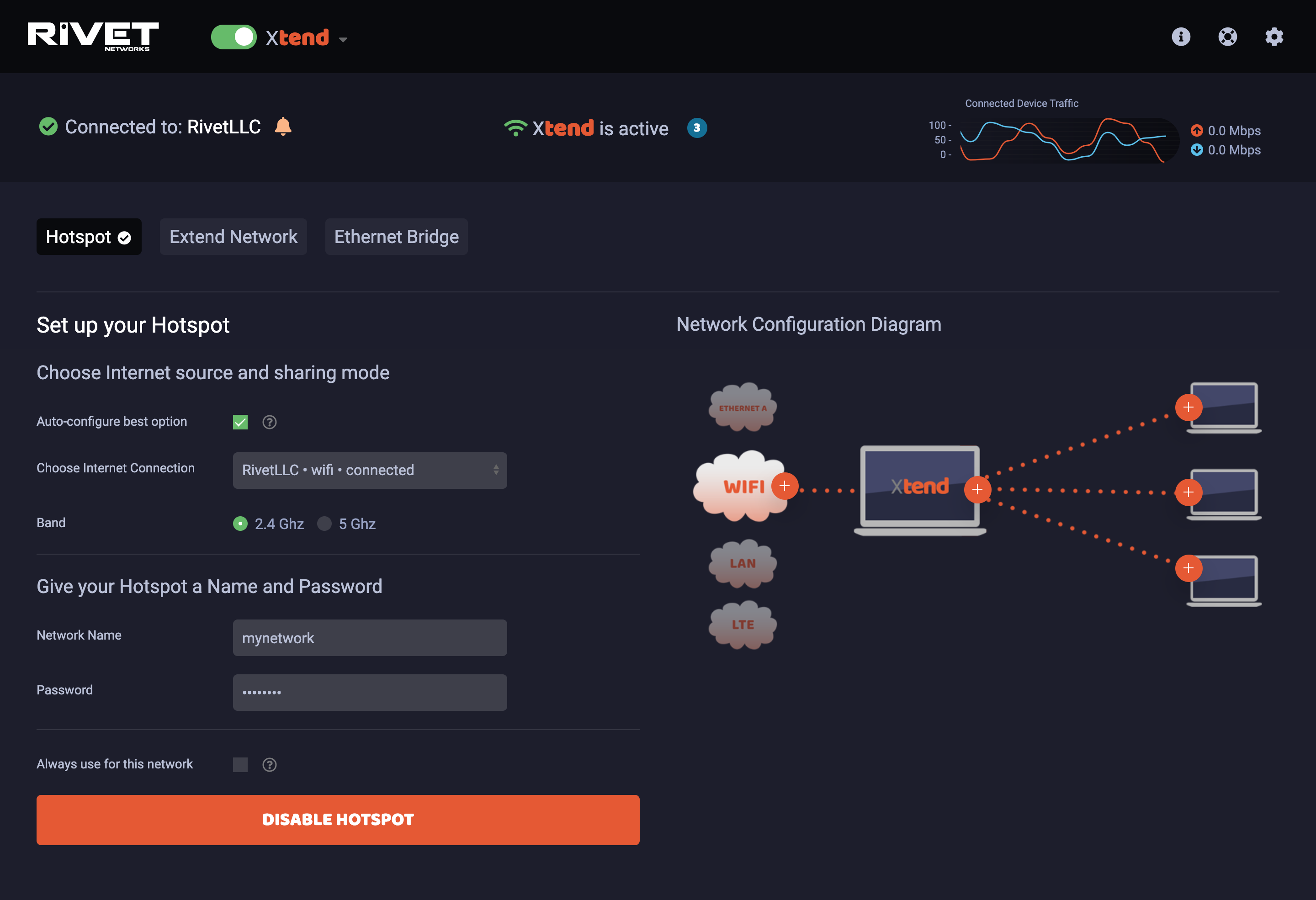
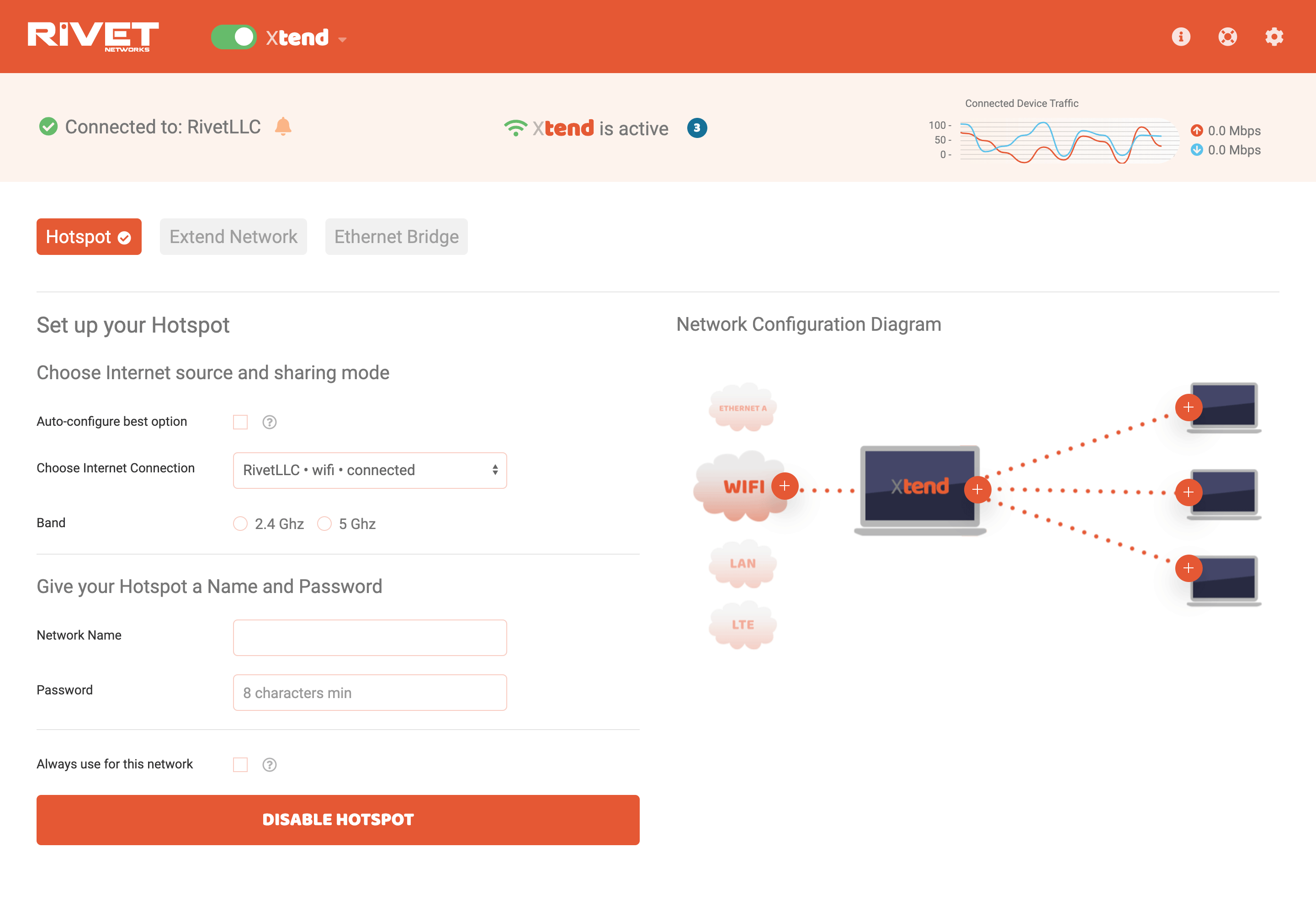
Xtend (Original UI - before)
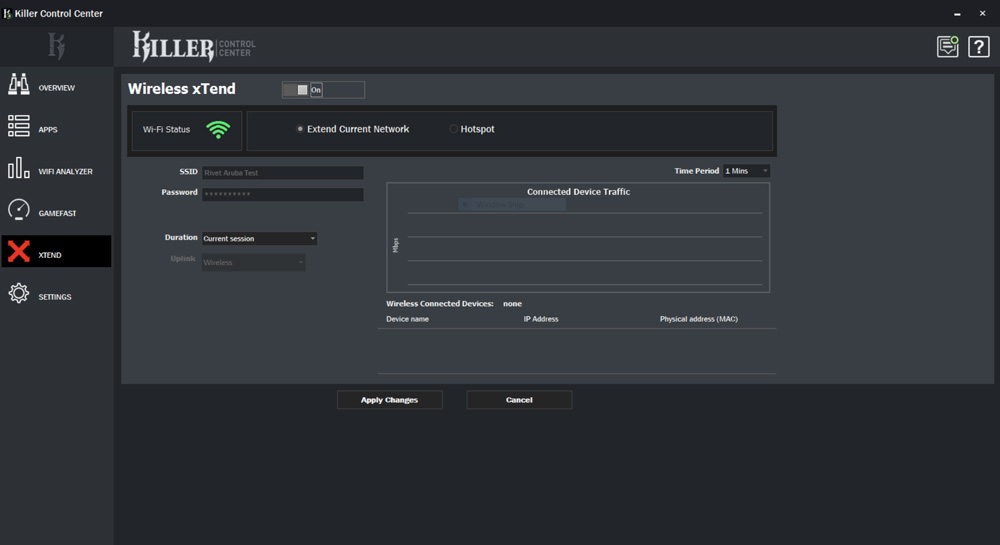
Web Application (Redesign - after)

Light Mode option for UI
For the web applications, I designed and created a light and dark color scheme option for the user to choose from. A dark UI option can be useful to help maintain user focus. This is to accommodate the gamer who tends to keep a low-lit environment and often has multiple windows open at a time.
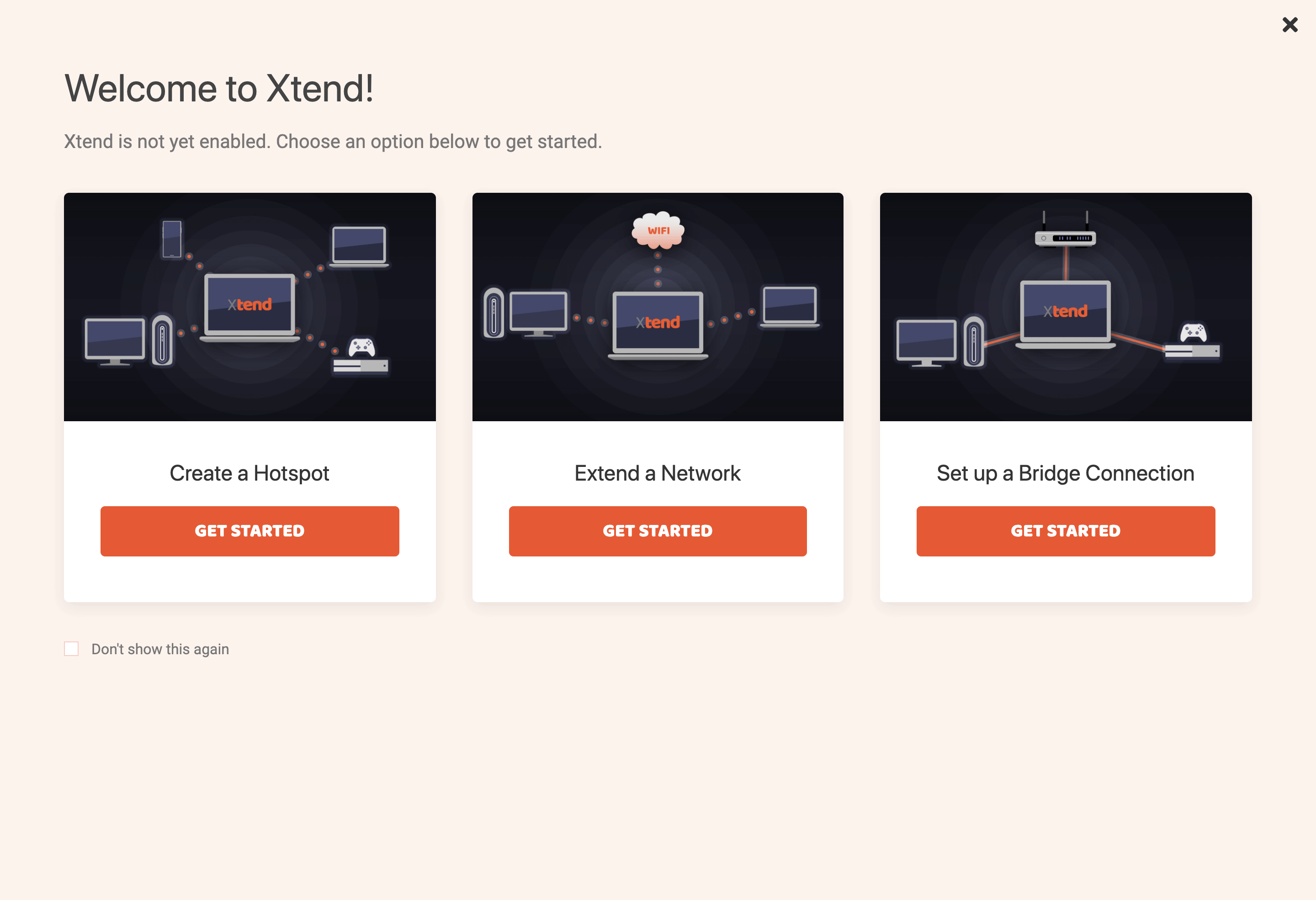
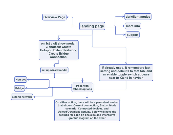
Onboarding user flow
For the web-based versions, I proposed a simple onboarding sequence to fast track the user to set up and enable a hotspot, extend a network or bridge devices over ethernet.
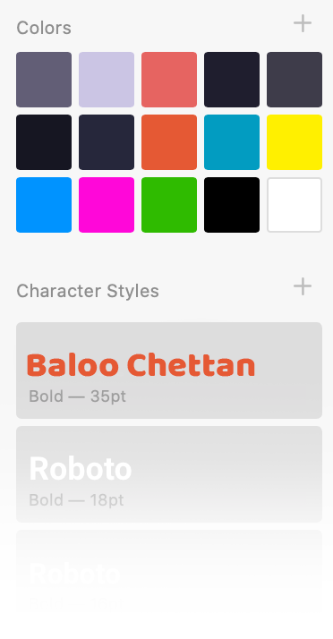
Brand Identity
In my competition analysis, I found that the Rivet and Killer brand needed a little attention in order to better represent the product and be set apart from the others. I helped create a unique color scheme and design language that helped to properly elevate the product, and to unify the stand-alone web app, the windows app, as well as for future-forward marketing materials.

Animated Videos
After all the work was wrapped up for the apps, the marketing team learned that I had some animation skills from my 'Flash days', so I was asked if I could help put together some videos. This is one of two videos I produced using Adobe Animate, Illustrator, and Premiere to illustrate certain value props Killer technology has to offer.
Outcomes
I helped the folks at Rivet by providing a comprehensive design language and left them with deliverables such as two fully functional front-end web applications, a complete design overhaul for their DevExpress WinForms embedded application, brand identity direction, including a concept for a new corporate marketing site (seen at top of page), and two animated videos ready to be published.