My Role
Senior UX Designer 2018-2019
FTSkills
UI Design UX Design Visual Design Prototyping Responsive Design Design Systems Pattern Library Brand Strategy Illustration Wireframing Data Visualization Interaction DesignTechnologies
Sketch Invision Marvel Photoshop Illustrator HTML CSS CSS Grid / Flex Font-end Frameworks Github Sublime Text Javascript Ruby Angular JSCompany
Carnegie Technologies | NXTBoard
SaaS B2B B2C StartupBackground
Nxtboard is one of the many business incubators at Carnegie Technologies but is the only SaaS product in the fold. Nxtboard targets solutions for board room management and productivity, but also has an embedded service solution to help the Texas Education Agency (TEA) track and manage progress measures and accountability for school districts with poor performance.
Project Goals
- Identify personas and define roles and permissions
- Identify the main problem areas and create a roadmap for the redesign
- Improve onboarding process
- Optimize overall user workflow
- Decide upon a scaleable front-end framework and component library
- Apply new branding to the design system & visual language
- Integrate TEA Lone Star Governance Continuous Improvement Framework
Project
Nxtboard was needing to streamline and reorganize the existing product features to a more intuitive workflow and to define and apply an agreed-upon visual language.
Approach
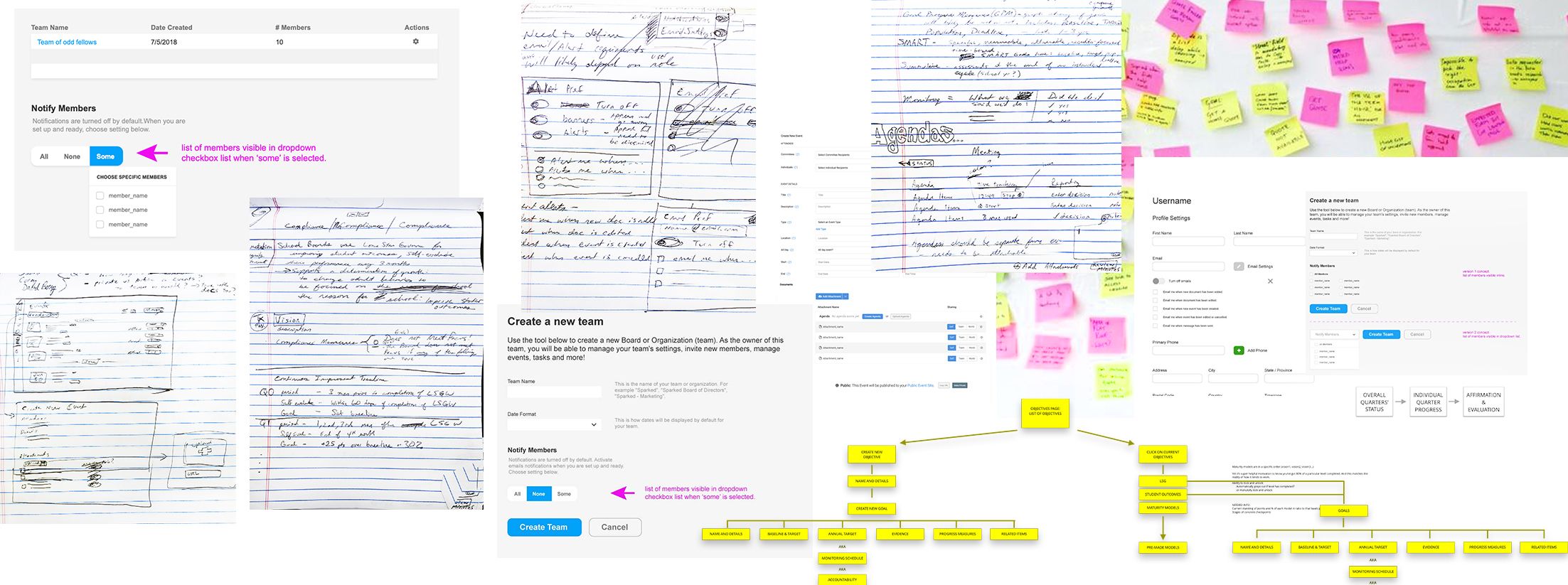
Working closely with the product owner, CEO, and many other team members, I spent some time researching board room sessions and interviewing the main stakeholders and sales staff to better understand the product goals. After identifying personas, conducted user interviews and product testing to discern common pain points in the app, and started to sketch out ideas. After many quick iterations, I started building out a prototype and conducted further user testing sessions to validate our new user flows.
Dashboard
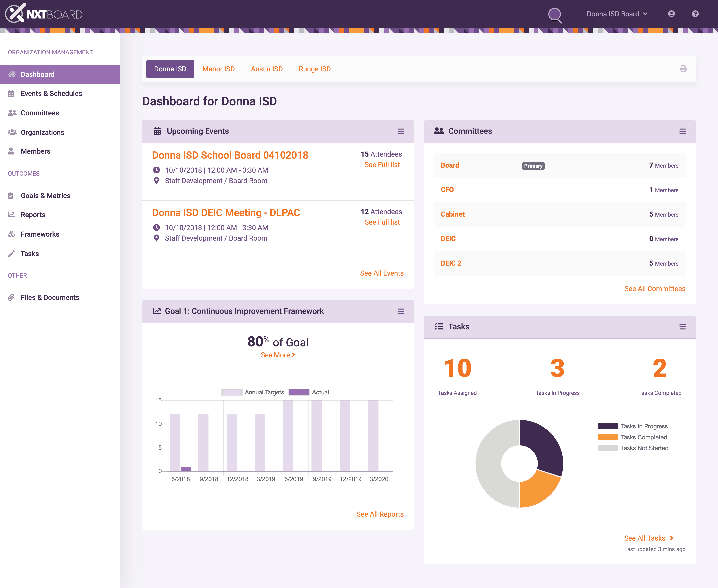
After getting user feedback about most desired features, we decided that the dashboard page should be the first place to land after on-boarding. The user gets a quick view of all upcoming events, progress reports, and task status.
Events
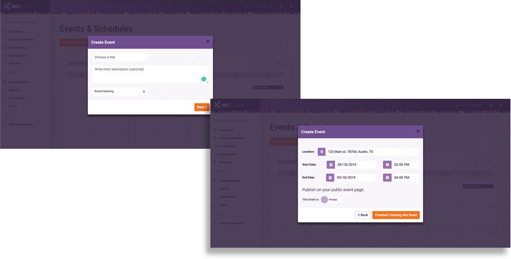
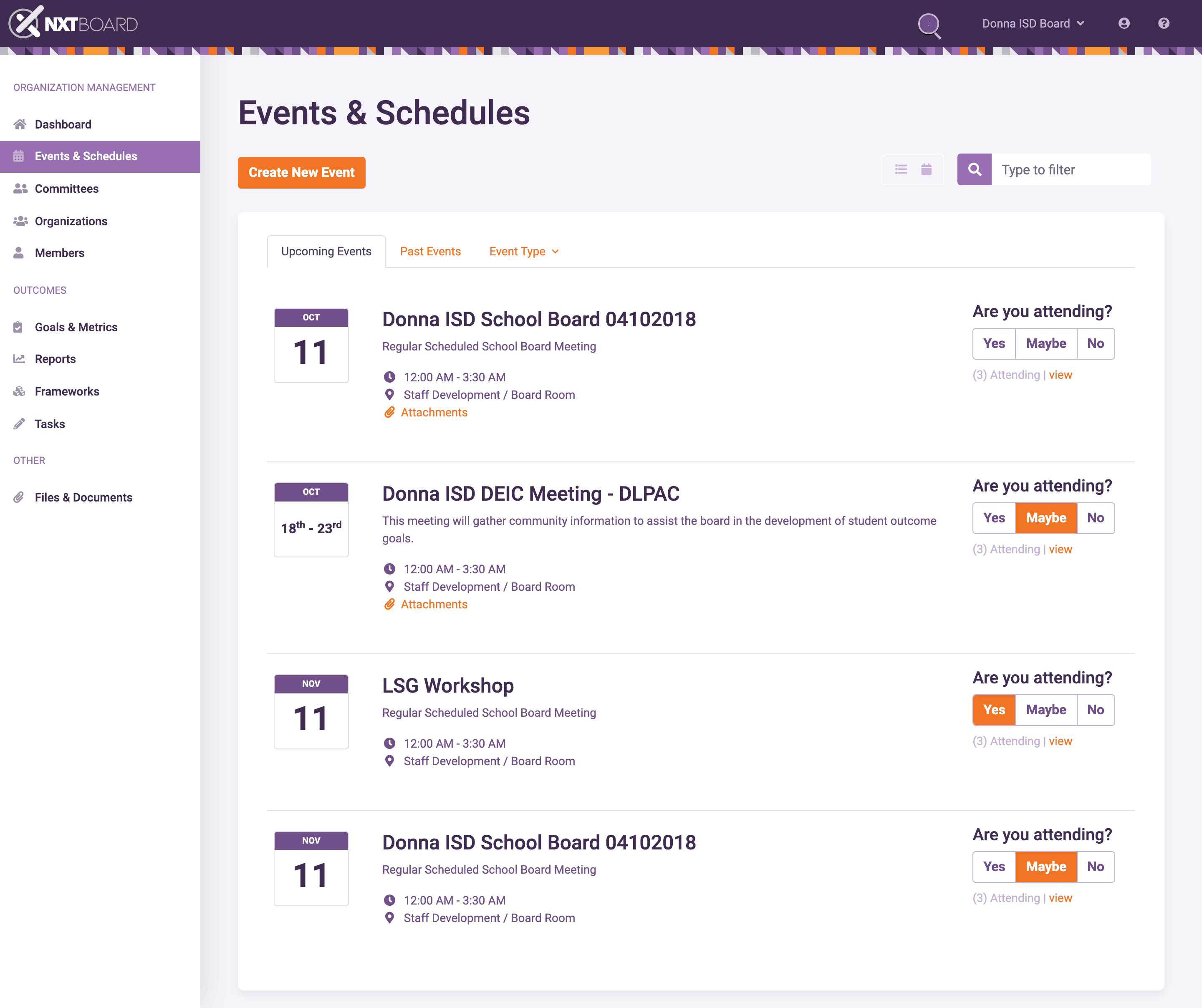
Many updates were made to the Events page (unfortunately I don't have screenshots of what it looked like before...), including a way to toggle between a list view and calendar view, the ability to initiate the creation of a new event, event details, and the ability to rsvp. These were mentioned often as desireable features for the list page.
Event Details
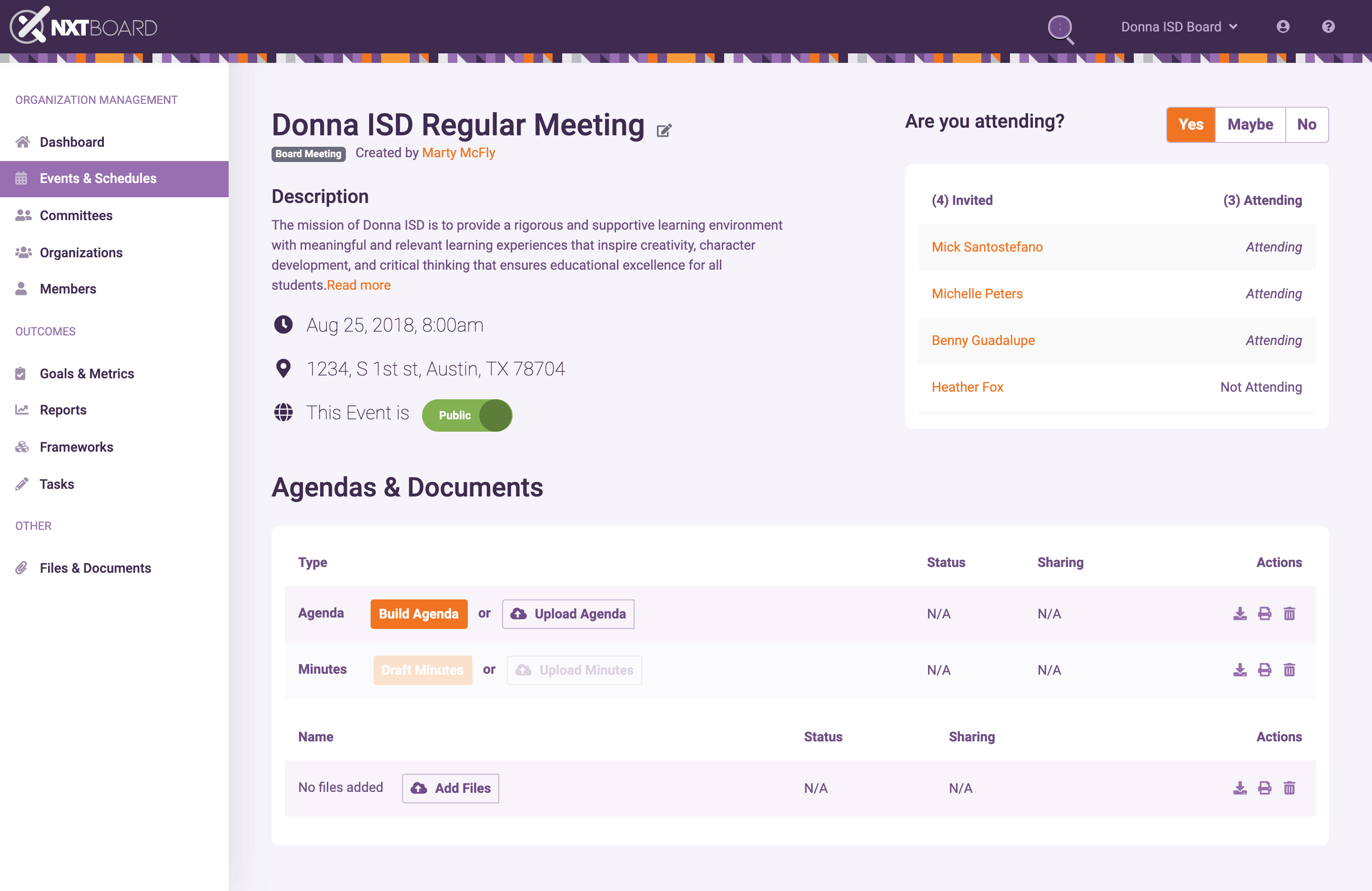
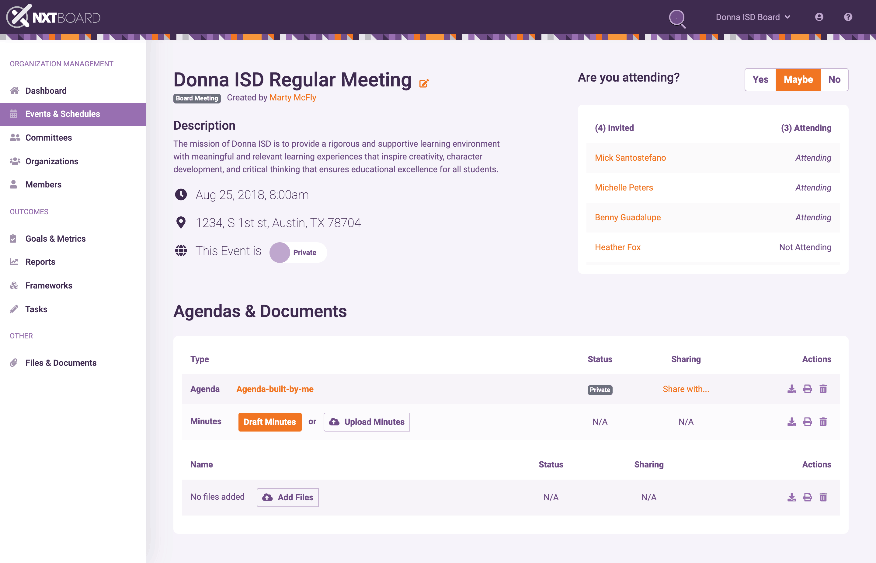
There were a lot of problems to solve on the event details page, like solving for what controls would be available for which persona. For instance, in Fig. 5, only event creators and those given permission to edit events would be able to make the event 'private' or 'public'. Also, event creators only are able to create and edit agendas and minutes.
Create Agenda
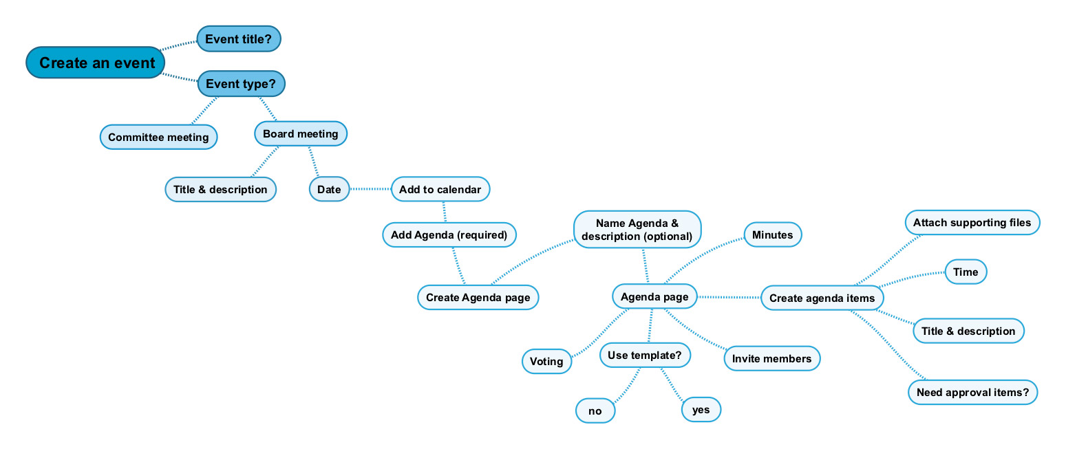
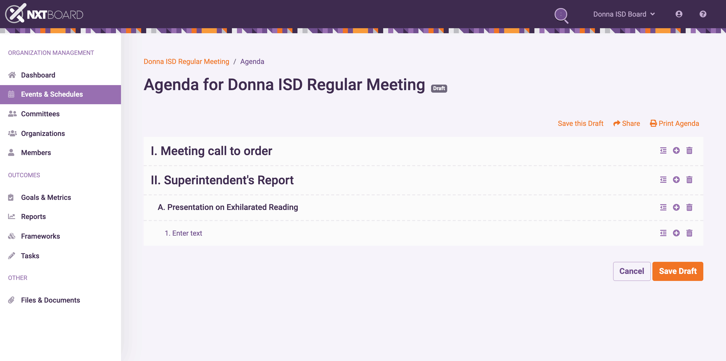
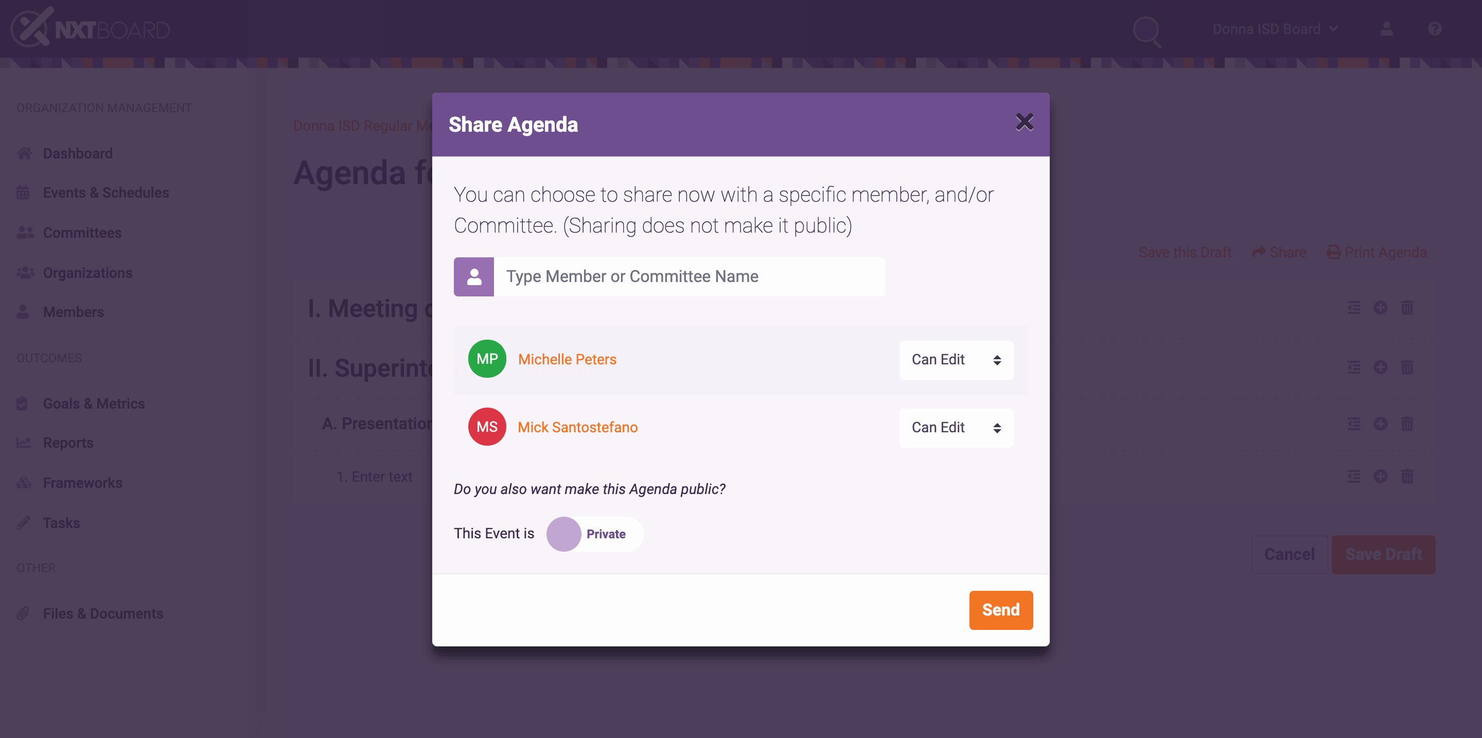
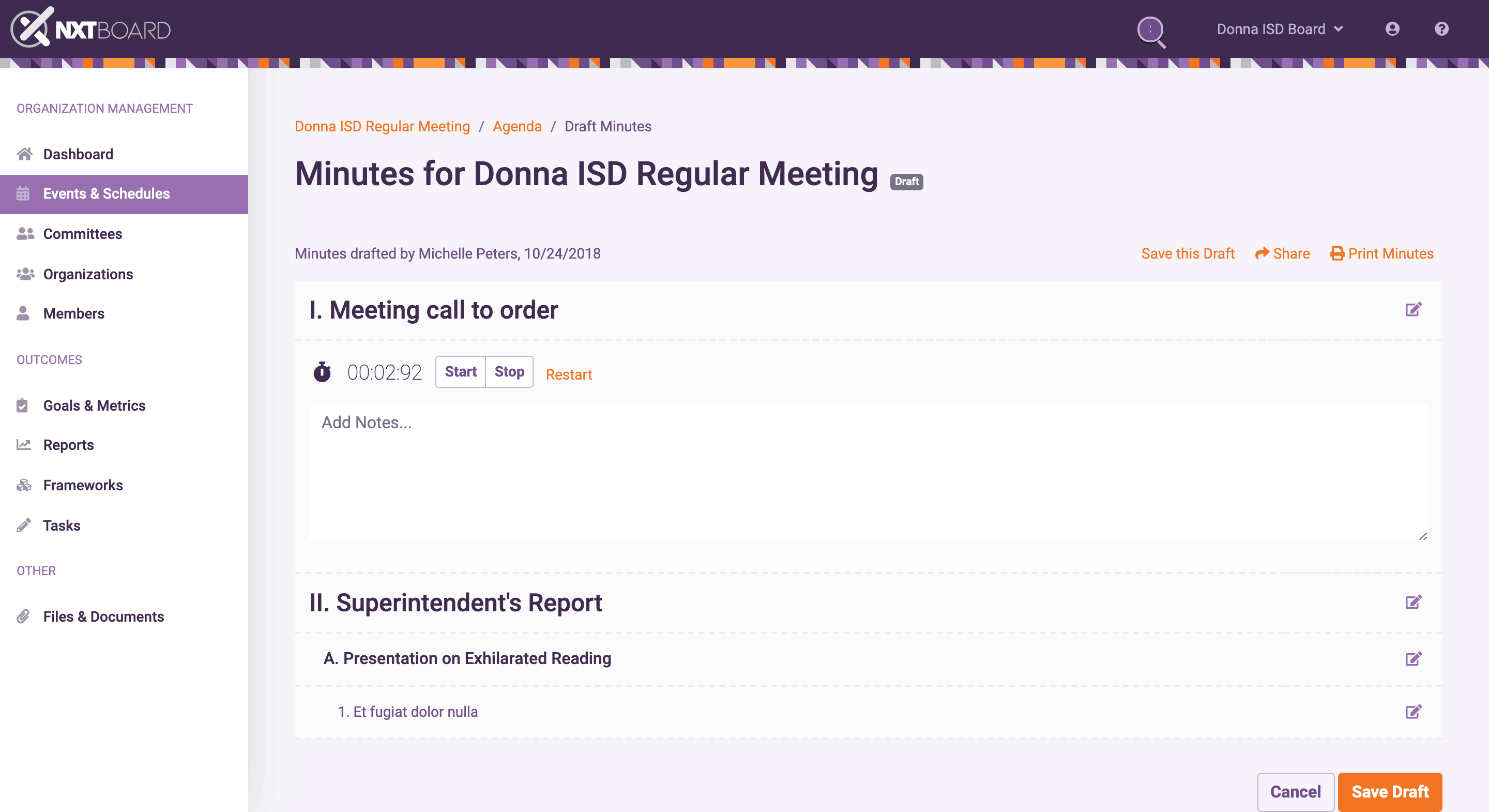
Another challenge to solve was how a user would draft and share agendas. Most board members that have created agendas usually built them in a document editor like Google docs or Microsoft Word. The main issue to solve was regarding privacy documents. Agendas and Minutes needed to be kept in a safe place and time-stamped for legal reasons, so we decided to build an embedded editor in order to control the workflow and a simple way to share documents and permissions (See fig. 6, 7).
Continuous Improvement Framework (CIF)
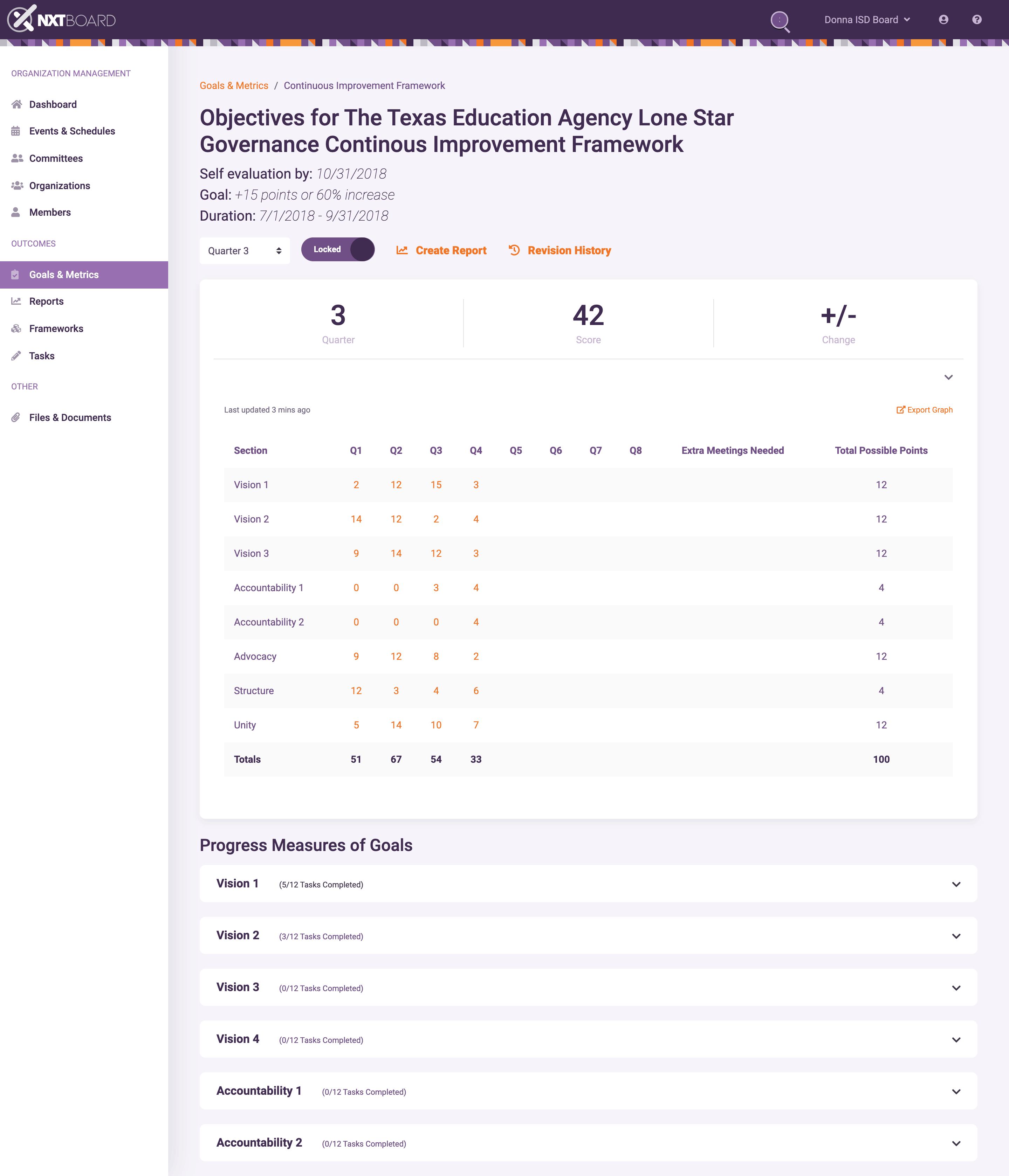
The CIF was the most challenging aspect of the product to design. It was often discussed whether it belonged as part of the app, or be a stand-alone platform. I am not sure what was ultimately decided since I joined the Longview team.
The Texas Education Agency is the state agency that oversees primary and secondary public education. Headed by the commissioner of education, the Texas Education Agency aims to improve outcomes for all public school students in the state of Texas by providing leadership, guidance, and support to school systems.
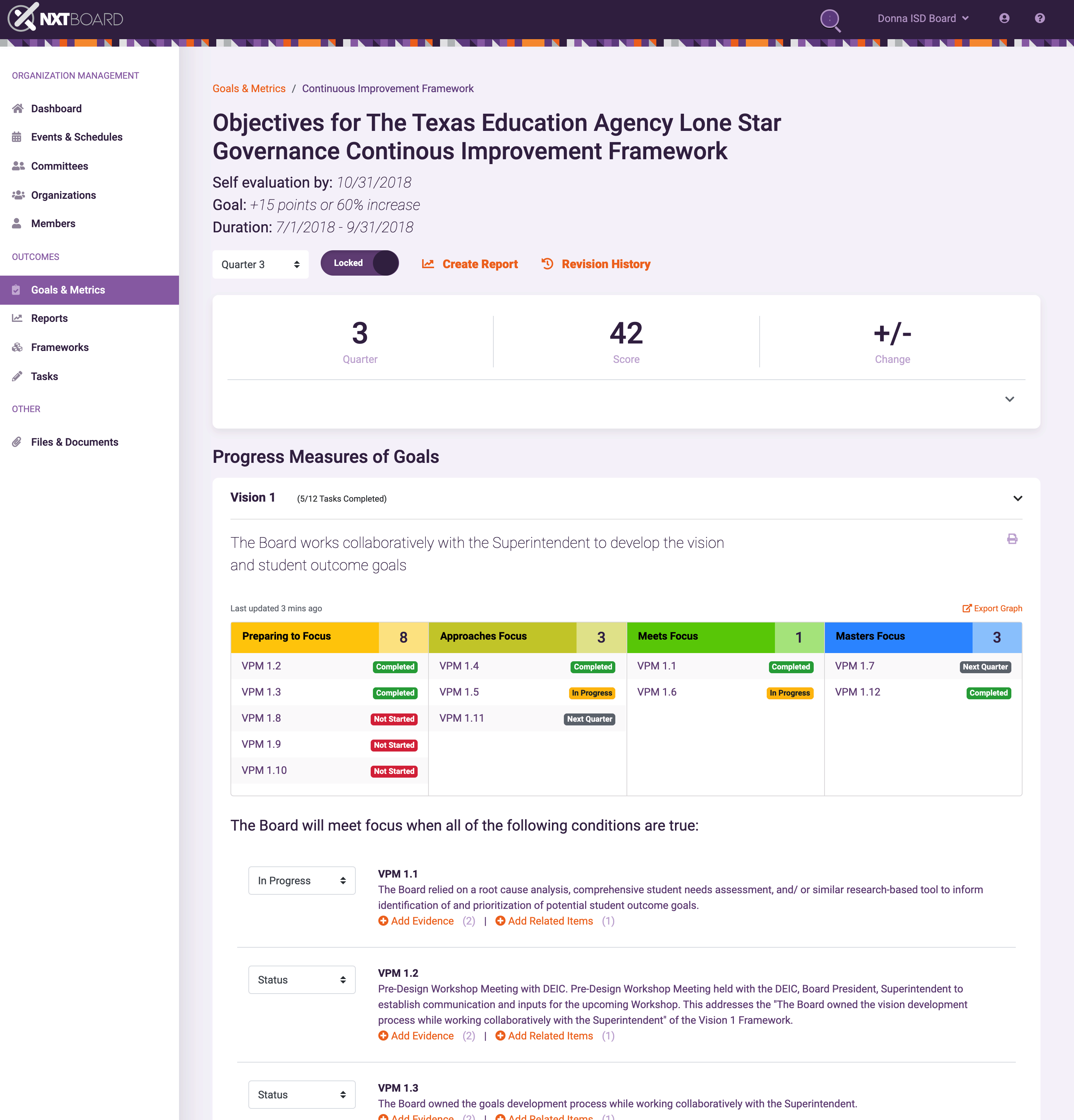
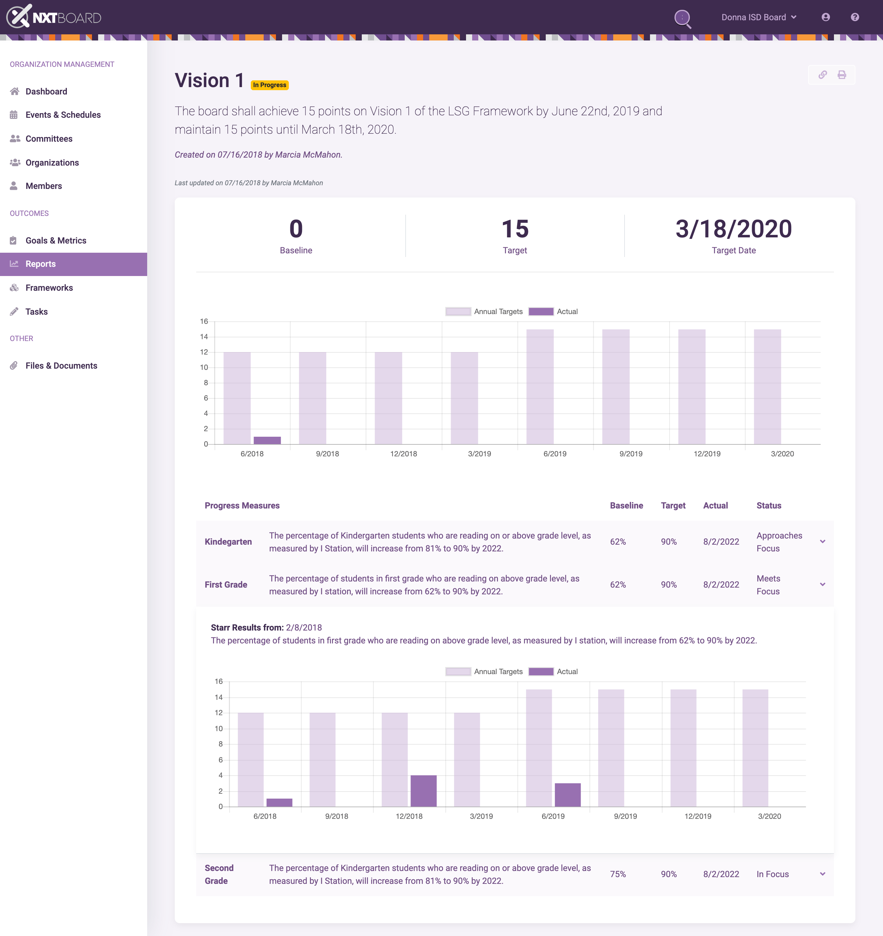
The problem they faced was being able to easily track and verify certain progress measures the schools made (fig. 11). The main method used was following a very lengthy document that served as a guide. Our challenge was to condense the information down to a simple and organized digital experience that allowed the users to easily track progress and log progress evidence (fig.12). Another feature we added was to allow users to create shareable reports that showed progress over time.
Design System
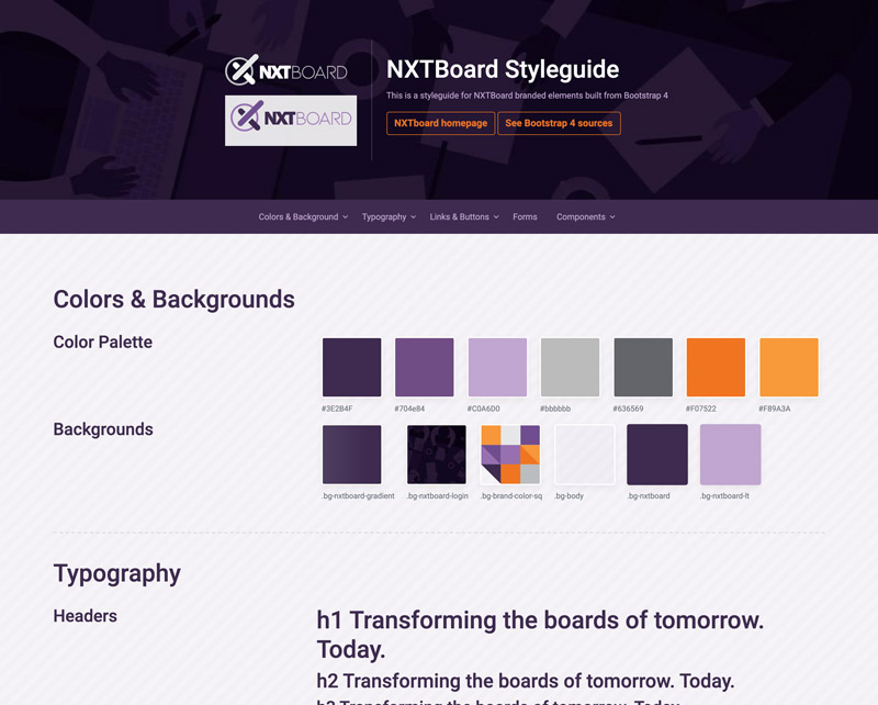
I built out a placeholder for the design system again using Bootstrap 4 for the layout and components. The plan was that all development and design teams would use this design system as a guide for visual styles, interaction design patterns, and control options.
See PrototypeOutcomes
As I mentioned earlier, I had to leave the project before the MVP was completed, so I am not sure where things landed. I can say that the designs proposed certainly influenced the direction of the product, and I received excellent feedback from stakeholders, as well as users during testing sessions on the overall designs I created while on the project. I enjoyed the challenge of taking a very complex process and simplifying it to a more useful and consumable product. Despite all the obstacles at first, I was able to leave the team with a better and more defined product that I am proud to display.
