My Role
Senior UX Designer 2018-2019
FTSkills
UI Design UX Design Visual Design Prototyping Responsive Design Design Systems Pattern Library Brand Strategy Illustration Wireframing Data Visualization Interaction DesignTechnologies
Sketch Invision Marvel Photoshop Illustrator HTML CSS CSS Grid / Flex Font-end Frameworks Github Sublime Text Javascript Ruby Angular JS Geo LocationCompany
Carnegie Technologies | Longview IoT
IoT B2B StartupBackground
The Longview IoT started as a platform for tracking livestock, but business objectives shifted towards the oil and gas, industrial, and construction market. The goal of Longview was to help supervisors and inventory specialists track, measure, and manage assets like workers and equipment. Longview also had engineering labs working to develop more sensors for app integration.
Project Goals
With team consensus leaning towards a redesign, I had was given the go-ahead to begin rethinking the app. After initial research, interviews, and competitive analysis, I started drafting up design mockups to help the team visualize how it could look and flow.
- Improve usability
- Visualizing a version 2 of the existing product
- Organize and define product features
- Choose a front-end framework that would scale well
- Develop a design system & visual language
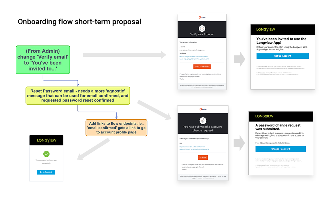
- Improve onboarding workflow
- User flow optimizations for version 1
Project
The biggest challenge our team faced in this project was in trying to fix all the issues that predated the inclusion of designers on the project. At the moment, the team's main directive was to knock out an enormous design backlog to address the many UX and UI issues that riddled the app. The lead designer and many product owners were convinced the best way to achieve success with the project was to rethink and remake the app. In the meantime, production continued on the original version...
Approach
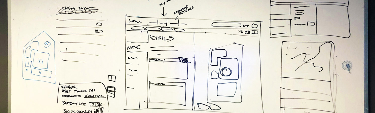
Our strategy to address the UX problems was to give an alternative perspective that would allow for team members and stakeholders to understand that a redesign might be the quickest and most efficient way to a successful product. With that in mind, we agreed the priority was to launch a 'skunkworks' project to reflow the app. I spent two weeks mapping out, organizing, reflowing, and building a live prototype using Bootstrap 4 for the components as a means to a quick and scalable product.
Reflowing & Revisualization
The screenshots below show comparisons of the app as I found it and the redesign proposals I made in the prototype I built.
Dashboard
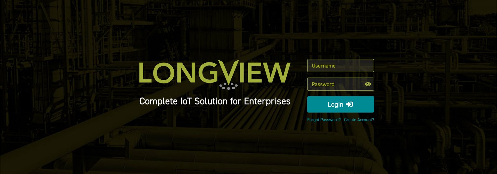
After a quick heuristic assessment on the current app, I found in the existing dashboard to have the most issues with usability. The existing dashboard was, for the most part, a long list of links representing zone areas showing a count of each asset present that linked to a map view.
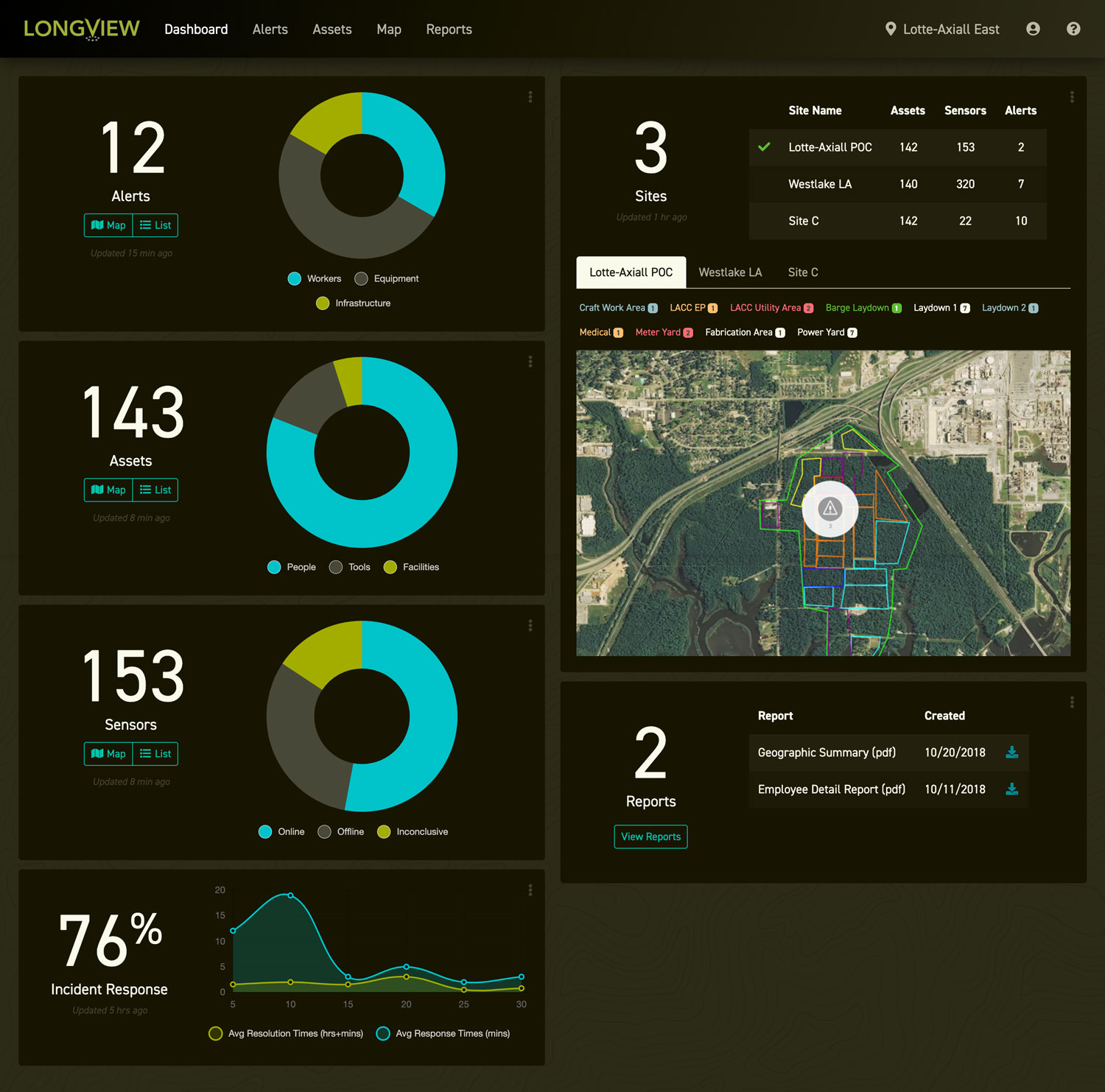
Redesign proposal
I felt that the dashboard should be a place that an administrator should be able to see all the most important data. So I proposed a dashboard that can show status reports for all areas of the app, as well as data visualizations and easier ways to view multiple sites and zones through an embedded map.
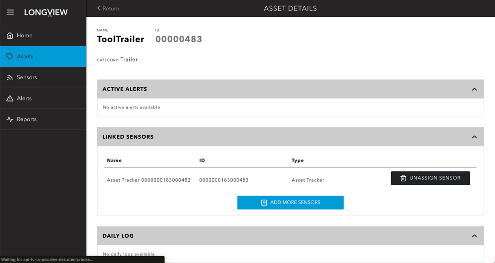
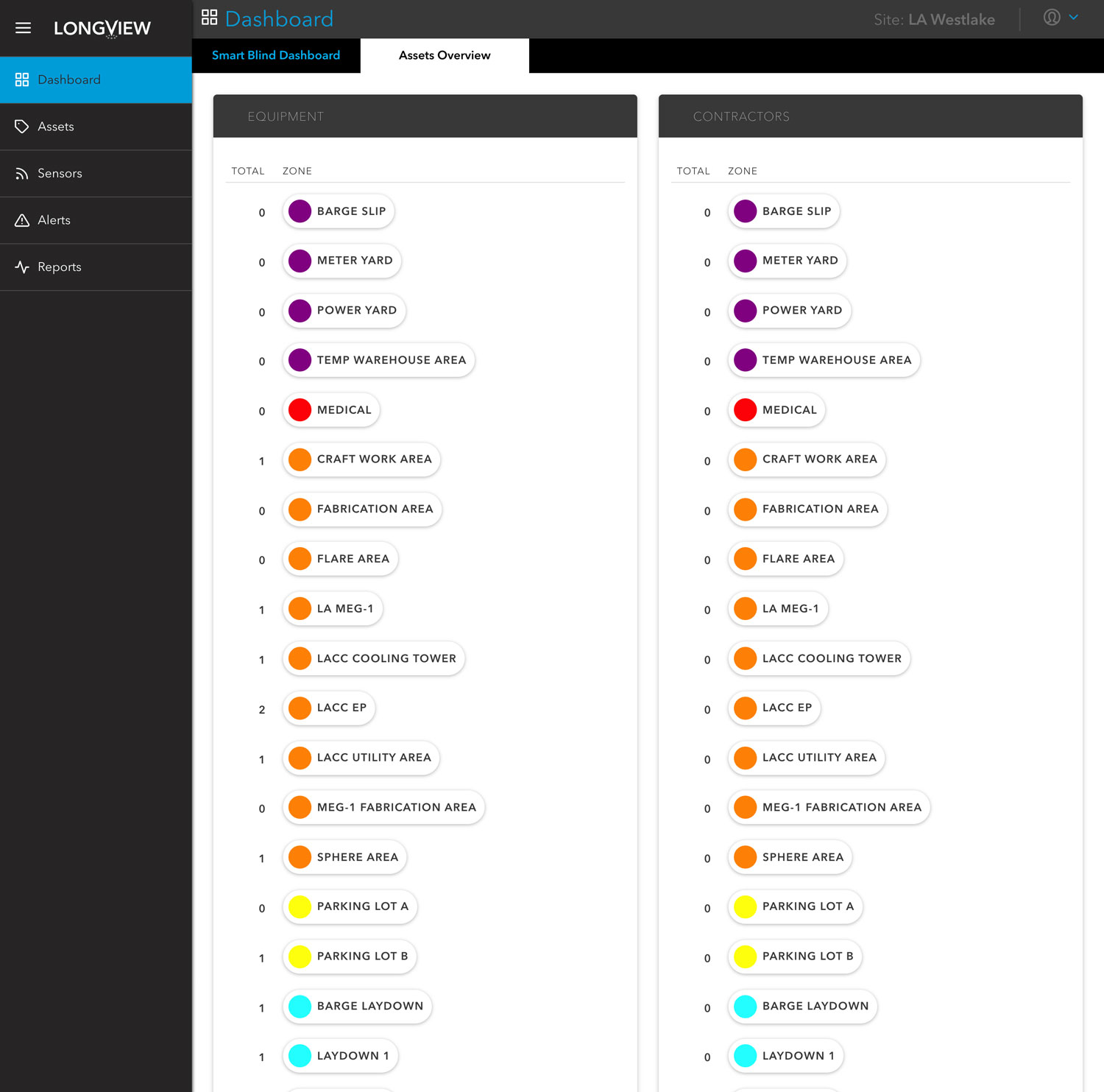
Asset details list view
The asset list view page had several issues needing to be addressed. One of which was the filtering system. The side navigation was confusing and it was difficult to determine hierarchy, and some of the links were actually filters. The flow was disorienting when a user drilled down to see more details on a specific asset.
Redesign proposal
I added a filter section above the list, removed the sidebar altogether, and made the details view an overlay to maintain page orientation with less disruption.
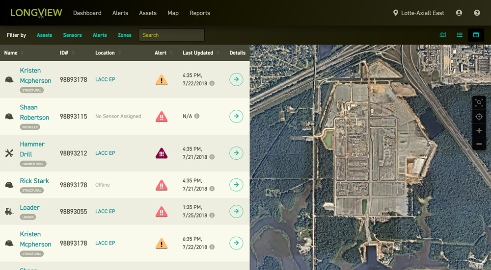
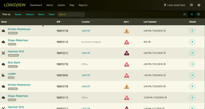
Split view feature
The existing design allowed for only two views, and I felt that a combination of those views could be helpful. I created an option to toggle between list, map, and split view anticipating the use-case where an administrator could choose to see both the map and a list to quickly scan for assets.
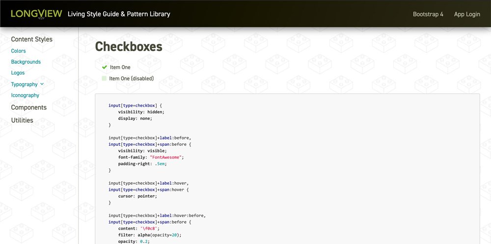
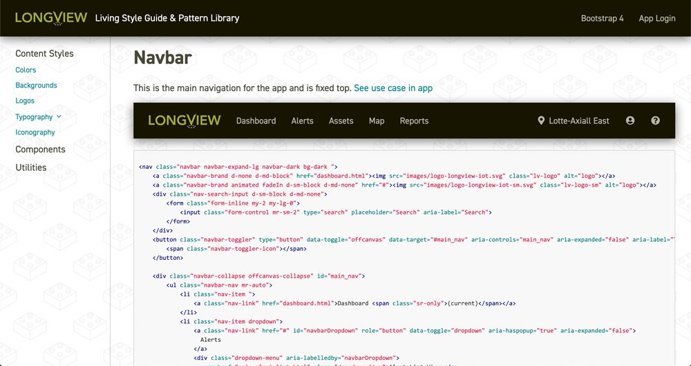
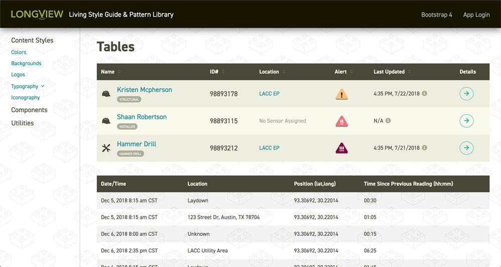
Design System
When creating a cohesive design, having one place and a source of truth where components, styles, and brand resources live to be shared across teams is GOLDEN. I put together a design framework similar to Pattern lab, but unlike their default UI layout, which is just a list of elements, components, I chose to reflect the brand and styles as well in the elements and components as well as the framework that contains them. Ultimately my hope was for this living Pattern library/Design System to help align design and developer teams, (which were in a fairly siloed environment), and provide a single place for all updates to the product to be made and documented. This way the latest code and styles were always accessible to the entire team and styles were consistent.
"Design systems are a product as well." - Dan Mall
Email Templates
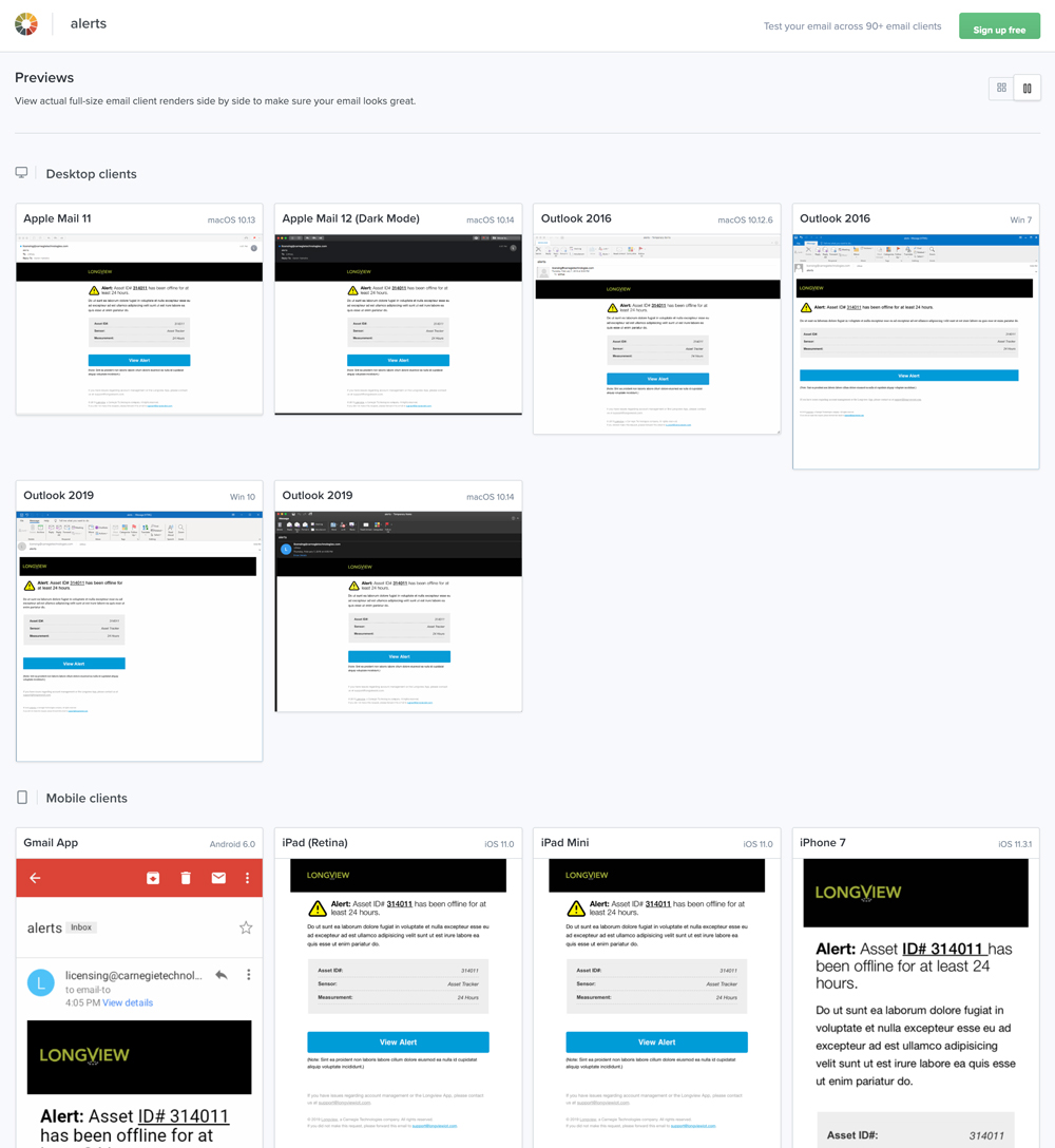
Our team required some email templates that needed to be cross-browser compliant, email client, and device friendly. I was the only person in the company that knew how to build them. I started out putting together optimized user flows that would help bring some clarity to pre-existing emails that were put together using Auth0's templates. After designs were approved, I built and tested them using Litmus.
Outcomes
When I arrived on the project I was a fresh set of eyes not yet integrated into the sprints. The overall team felt I could objectively approach the project and help imagine a better way to re-flow the ideas we proposed. When we presented this new approach, it was very well received and convinced the stakeholders and the team members to set into motion a plan to build a "V2".